BAR CHART: a ggplot balance plot (2)

BAR CHART+LINE

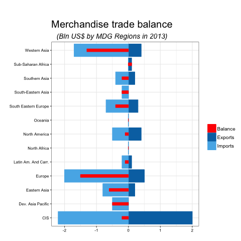
Graph 2: Merchandise trade balance

You can find the data for this plot here or alternatively here is the dput data for balance:

structure(list(variable = structure(c(1L, 1L, 1L, 1L, 1L, 1L,
1L, 1L, 1L, 1L, 1L, 1L, 1L), .Label = "Merchandize Trade Balance", class = "factor"),
type = structure(c(1L, 1L, 1L, 1L, 1L, 1L, 1L, 1L, 1L, 1L,
1L, 1L, 1L), .Label = "Balance", class = "factor"), year = c(2013L,
2013L, 2013L, 2013L, 2013L, 2013L, 2013L, 2013L, 2013L, 2013L,
2013L, 2013L, 2013L), value = c(-0.5, -1.5, -0.1, -0.4, -0.2,
0, 0.1, -0.1, -0.6, -0.2, -0.2, -1.3, 0), geo = structure(c(2L,
4L, 7L, 9L, 1L, 6L, 12L, 5L, 3L, 11L, 10L, 13L, 8L), .Label = c("CIS",
"Dev. Asia Pacific", "Eastern Asia", "Europe", "Latin Am. And Carr.",
"North Africa", "North America", "Oceania", "South Eastern Europe",
"South-Eastern Asia", "Southern Asia", "Sub-Saharan Africa",
"Western Asia"), class = "factor")), .Names = c("variable",
"type", "year", "value", "geo"), class = "data.frame", row.names = c(NA,
-13L))
library(dplyr) #to manipulate the dataset
library(ggplot2) #plotting
mer.bal <- mydt %>%
filter(variable == "Merchandize Trade Balance")

base <- mer.bal %>%
filter(type != "Balance") %>%
mutate(
value = ifelse(type == "Exports", value, -value)
)
balance <- mer.bal %>%
filter(type == "Balance")

ggplot(balance, aes(x = geo, y = value, fill=factor(type))) +
geom_bar(data = base %>%
filter(type=="Exports"), aes(col=type), stat = "identity") +
geom_bar(data = base %>%
filter(type=="Imports"), aes(col=type), stat = "identity") +
geom_bar(data = balance, aes(col=type), stat = "identity", width=.2) +
ggtitle(expression(atop("Merchandise trade balance", atop(italic("(Bln US$ by MDG Regions in 2013)"), "")))) +
theme_bw()+
theme(axis.text.x = element_text(size=8, color="black"),
axis.text.y = element_text(size=8, color="black"),
legend.text=element_text(size=10),
plot.title = element_text(size = 20, face = "bold", colour = "black", vjust = -1))+
scale_fill_manual(values = c(Exports = "#0072B2", Imports = "#56B4E9", Balance="red"), name="") +
scale_colour_manual(values = c(Exports = "#0072B2", Imports = "#56B4E9", Balance="red"), name="") +
coord_flip()+
labs(x = "", y = "")

graph3

BAR CHART + LINE: a ggplot balance plot (1)

You can download session 9 files here (R-Ladies Tbilisi) and specify your working directory with setwd(“/Users/mydomain/myforlder/)

BAR CHART + LINE:

###Graph 1: Total services trade, by value

 require(ggplot2)
require(dplyr)
mypath <- "/Users/StayPuftMarshmallowMan/Shandor Folder/"
setwd(paste(mypath))
mydt <- read.csv("Georgia_Data_UN.csv", header=T)

head(mydt)
##                                            variable     type year   value
## 1 GDP: Gross domestic product (million current US$) economic 2014 16530.0
## 2 GDP: Gross domestic product (million current US$) economic 2010 11638.0
## 3 GDP: Gross domestic product (million current US$) economic 2005  6411.0
## 4    GDP growth rate (annual %, const. 2005 prices) economic 2014     4.8
## 5    GDP growth rate (annual %, const. 2005 prices) economic 2010     6.2
## 6    GDP growth rate (annual %, const. 2005 prices) economic 2005     9.6
##   geo
## 1
## 2
## 3
## 4
## 5
## 6
levels(mydt$variable)
##  [1] "Agricultural production index (2004-2006=100)"
##  [2] "Balance (million US$)"
##  [3] "Balance of payments, current account (million US$)"
##  [4] "CO2 emission estimates (tons per capita)"
##  [5] "CPI: Consumer price index (2000=100)"
##  [6] "Economy: Agriculture (% of GVA)"
##  [7] "Economy: Industry (% of GVA)"
##  [8] "Economy: Services and other activity (% of GVA)"
##  [9] "Education: Government expenditure (% of GDP)"
## [10] "Education: Tertiary gross enrolment ratio (f-m per 100 pop.)"
[...]
## [48] "Unemployment (% of labour force)"
## [49] "Urban population (%)"
## [50] "Urban population growth rate (average annual %)"
ser.dt <- mydt %>%
filter(variable=="Total Services Trade")

Balance <- ser.dt%>%
group_by(year)%>%
summarise(value=-diff(value))

Balance <- cbind(variable=c(rep("Total Services Trade", 13)),
type= c(rep("Balance", 13)), Balance, geo=c(rep("NA", 13)))

mydata <- rbind(ser.dt, Balance)

subset with the pipe operator %>%

base <- mydata %>%
filter(type != "Balance") %>%
mutate(
value = ifelse(type == "Exports", value, -value)
)
balance <- mydata %>%
filter(type == "Balance")

ggplot(balance, aes(x = year, y = value)) +
geom_bar(data = base, aes(fill = type), stat = "identity") +
geom_point(aes(colour = type)) +
geom_line(aes(colour = type, group=1)) +
scale_fill_manual(values = c(Exports = "#D55E00", Imports = "#E69F00"), name="") +
scale_colour_manual(values = c(Balance = "#660000"), name="") +
labs(x = "", y = "Total Services Trade")+
theme_bw()

Presentation1

DONUT CHART in ggplot2

 DONUT CHART

I personally don’t like pie charts that much, I prefer donut charts, they take up less space and the center can be used for extra annotations. In ggplot2 to get the “Donut” you design a bar chart (geom_bar) and then just bend it (coord_polar) at the extremities to get a donut.

To reproduce the chart below, you can download the data from the RLadies Tbilisi github webpage, Session 9 on Plotting.

Alternatively here’s the dput(-ted) data:

structure(list(X = 1:3, variable = structure(c(1L, 1L, 1L), .Label = "Export of Services", class = "factor"), type = structure(c(3L, 2L, 1L), .Label = c("Remaining", "Transportation", "Travel"), class = "factor"), year = c(2012L, 2012L, 2012L ), value = c(55.5, 33.4, 11.1), geo = c(NA, NA, NA), pos = c(27.75, 72.2, 94.45)), .Names = c("X", "variable", "type", "year", "value", "geo", "pos"), class = "data.frame", row.names = c(NA, -3L))

Exports of services by EBOPS category

#set the working directory
setwd("/Users/DrVenkman/The Gatekeepers Folder/")

require(tidyverse) #data manipulation

exp.ser %
filter(variable == "Export of Services")

exp.ser % group_by(year) %>% mutate(pos = cumsum(value)- value/2)

p <- ggplot(exp.ser, aes(x=2, y=value, fill=type))+
geom_bar(stat="identity")+
geom_text( aes(label = value, y=pos), size=10, fontface="bold")+
xlim(0.5, 2.5) +
coord_polar(theta = "y")+
labs(x=NULL, y=NULL)+
labs(fill="") +
scale_fill_manual(values = c(Remaining = "blue", Transportation = "#E69F00", Travel= "#D55E00"), name="")+
ggtitle("Exports of services by EBOPS category, 2013")+
theme_bw()+
theme(plot.title = element_text(face="bold",family=c("sans"),size=15),
legend.text=element_text(size=10),
axis.ticks=element_blank(),
axis.text=element_blank(),
axis.title=element_blank(),
panel.grid=element_blank(),
panel.border=element_blank())

p

graph2

 giphy

High Resolution Mapping of Fertility and Mortality from Household Survey Data in Low Income Settings – PAA presentation

I will present at PAA my WorldPop mapping of Demographic indicators in low-income settings at PAA in Chicago.  “Advances in Mathematical, Spatial, and Small-Area Demography”, Thursday, April 27, 2017: 10:15 AM – 11:45 AM, Hilton, Joliet Room.